A redesign of the Untappd UI using AI design patterns
Context
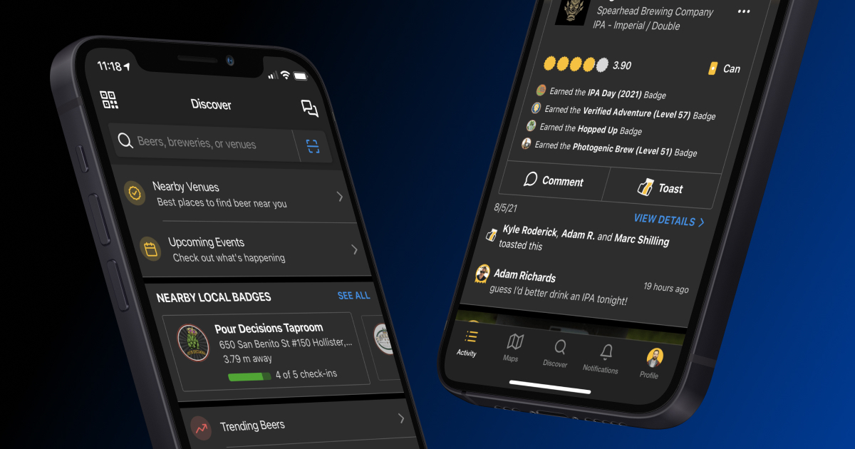
I tried to improve the digital user experience of Untappd, a widely-used beer reviewing app. Untappd significantly influences the craft beer industry, as users ratings directly affect sales and reputations of breweries. However, my research indicated a critical issue: many Untappd users lack sufficient beer-tasting knowledge, resulting in superficial or uninformative reviews. Brewers, in particular, expressed frustration over the absence of meaningful feedback that could help them improve their products.
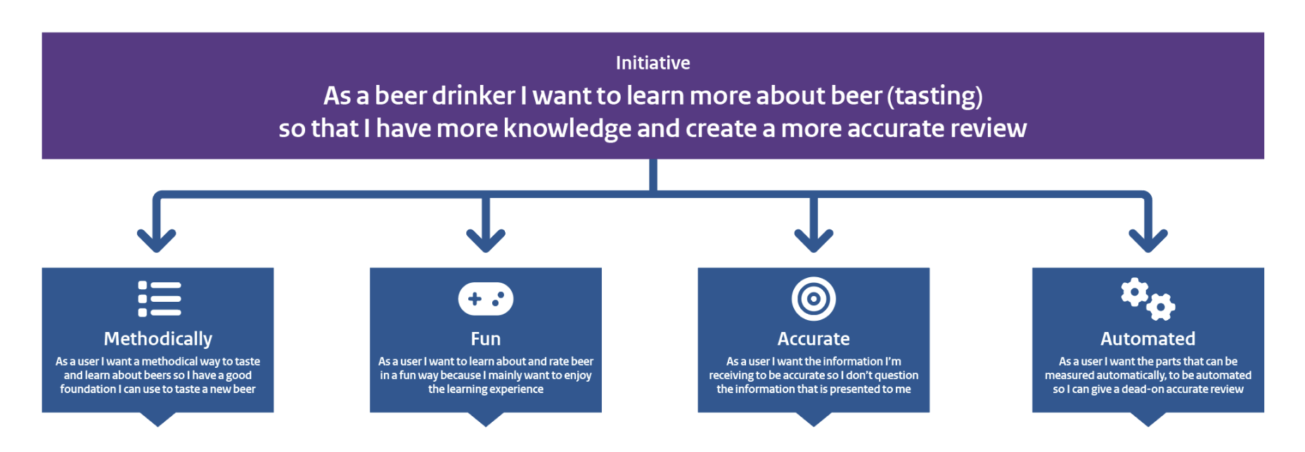
To address this, I set out to create a smarter, more informative reviewing experience that would increase users beer knowledge, leading to more accurate and helpful ratings.
Research & Insights
I began with an in-depth observational study to understand Untappd's influence within the craft beer community. I discovered that user-generated ratings often created a “bandwagon effect,” where ratings were influenced more by popularity than genuine beer quality. Expert interviews further supported this finding, as I talked with a craft beer shop and restaurant owner, and a certified beer expert (Cicerone Level 2). Both experts highlighted the need for better education and more detailed reviews to improve the accuracy and reliability of ratings. This is important as appreciation should rely on quality of the product and not so much on branding. That is why I wanted to improve the Untappd UI so it would be a platform where more knowledge is shared whilst sharing this information would not take more time for the user.
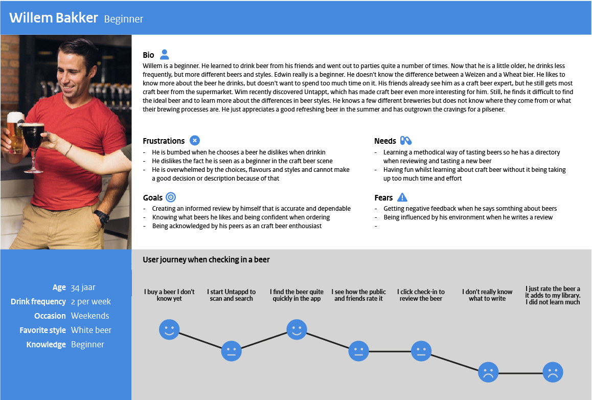
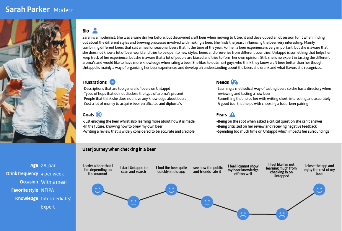
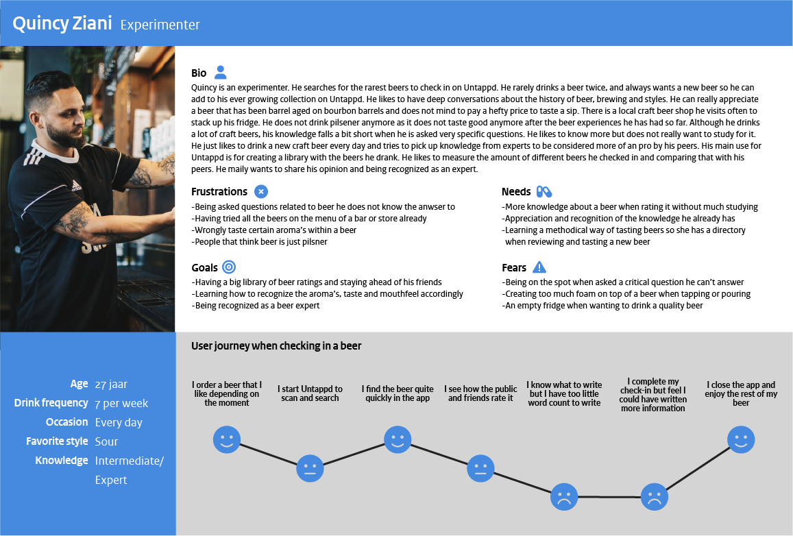
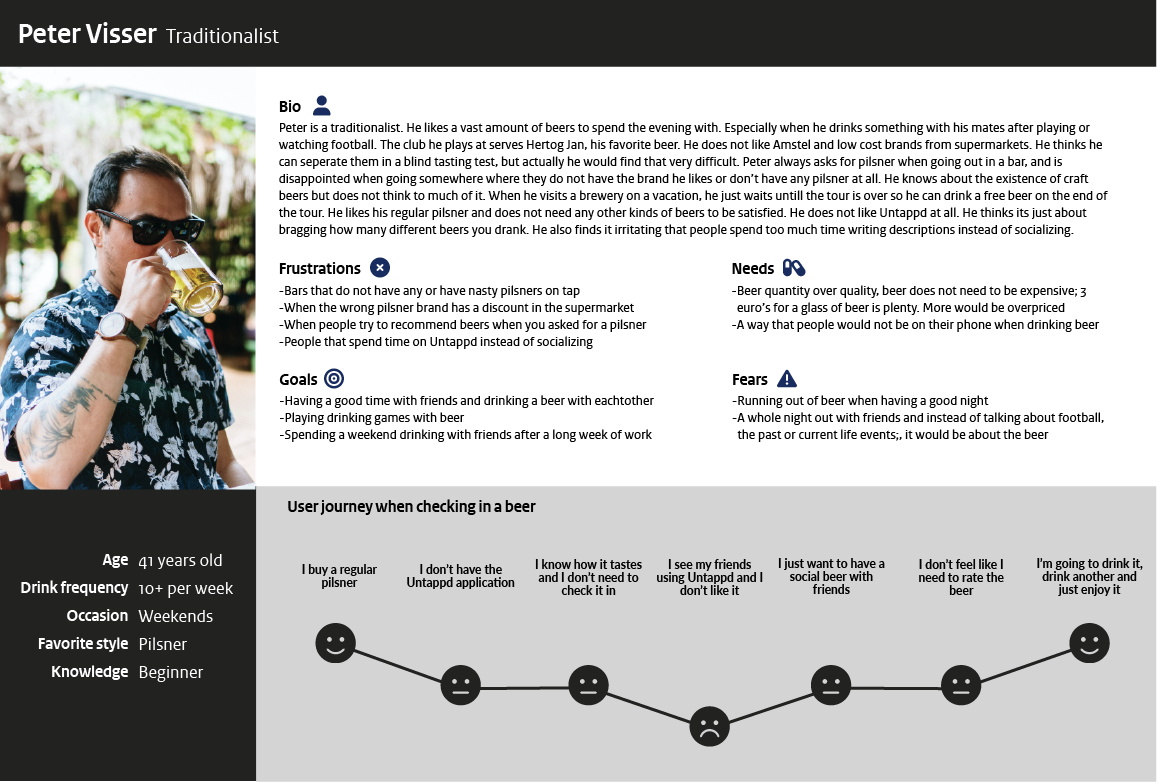
I identified three key user personas that would want to learn or share their beer expertise: Beginners, Modernists, and Experimenters. They would benefit most from an enhanced reviewing interface. Traditionalists were excluded, as their needs did not align closely with Untappd's core audience.
Design Solution
The final design solution involved introducing multiple smart features directly into the Untappd reviewing interface, tailored specifically to user expertise levels:
Personalized user interfaces: I developed three distinct reviewing interfaces for Beginners, Intermediate users, and Experts. Each interface was customized, displaying only the relevant information needed at each expertise level to avoid cognitive overload.
Educational features: A brief tasting tutorial was integrated for Beginners and Intermediates, providing accessible, practical beer-tasting knowledge derived from expert sources like the Cicerone Beer Server program.
Dynamic 'smart' prompts: To encourage users to write informative reviews, we introduced an “autoprompt” smart feature. This feature dynamically generated descriptive sentences based on the user's ratings, selected tasting notes, beer style, and environmental context (e.g., drinking location, temperature, friends present). For users less inclined to write, I also integrated an option to auto-generate reviews using ChatGPT based on the data filled in.
Expert level features: Additional fields such as “Food Pairings” and “Production Date” were introduced for expert users, enabling richer, more contextual reviews that could benefit breweries and beer enthusiasts alike.
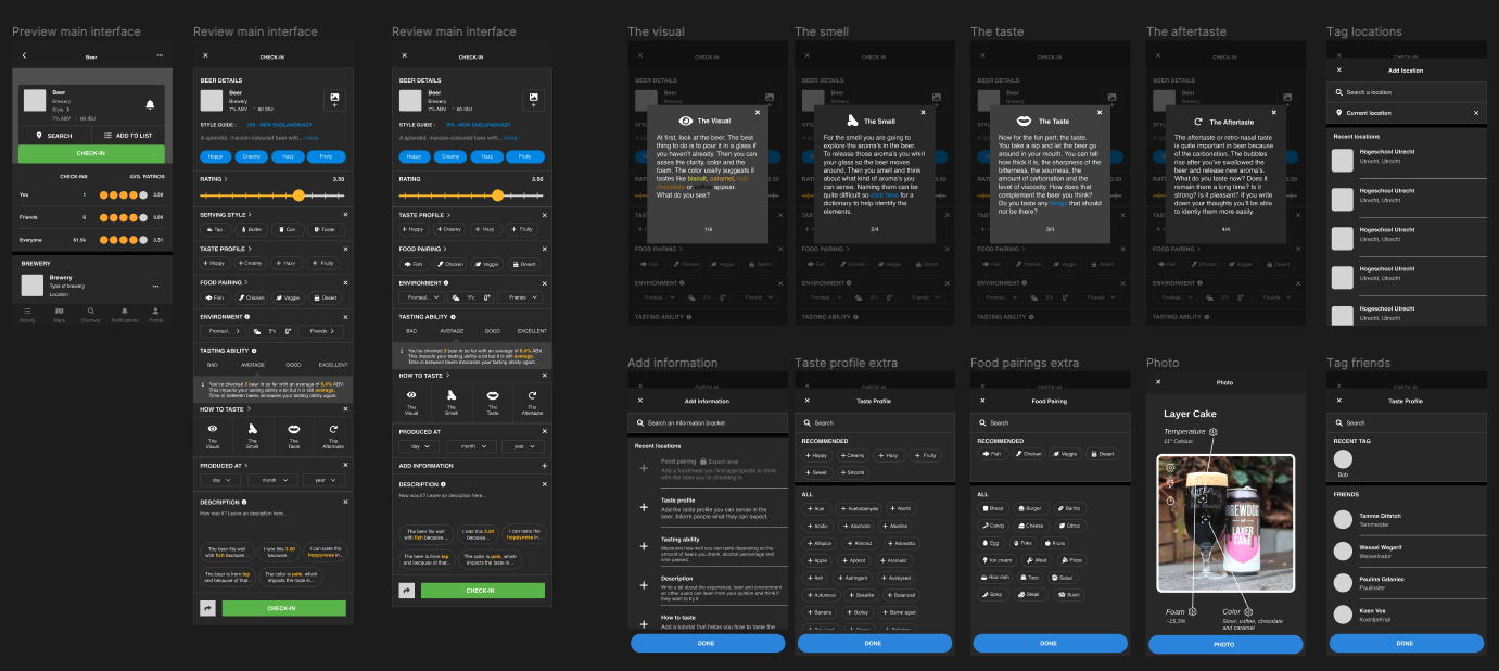
Throughout development, user testing was important. I iterated designs multiple times, using AB testing and feedback from real Untappd users at a craft beer venue. This rigorous testing informed design decisions like retaining the original Untappd interface structure and simplifying added features to prevent cognitive overload. Below you can see all screens within the rating UX and the design patterns I created.
Beer details
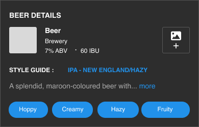
On top, we've added beer details in the review screen. Many people missed the details when reviewing the beer. So therefore we've added the beer name, style and description. You can also add the photo here, the color on the photo is helpful because an indication can be given for the EBC (color of the beer). This helps when identifying flavours.
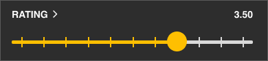
Rating
This pattern was present and is the core of Untappd. It still is the most important and we did not change anyting about it.
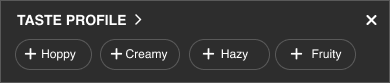
Taste profile
This pattern is present in Untappd. It still is important. We changed the display for the persona's a bit. Where Beginners would only see basic flavours like “Sweet” “Sour”, etc. Intermediates and Experts would see specific jargon like in the image.
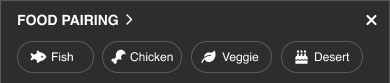
Food pairing
This is a new pattern we've added. A food pairing with the beer so Experts can show off their expertise and beginners would learn from it. It is exclusive for experts so it remains objective enough.
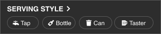
Environment
To prevent clutter, we've combined the location and tagging friends and added temperature so there is some information about the environment.
Foodpairing
A smart feature we've added that would see how many beers were checked in, the alcohol percentage and the time passed. Together they can say how well you can taste. All users can learn from this and think about their alcohol consumption.
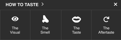
How to taste
A pattern that would help users with tasting a beer corretly. The information is gathered from literature from the Cicerone Beer Server programm and put into a small tutorial users can discover.
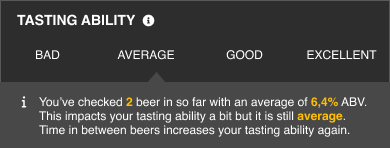
Tasting ability
A smart feature we've added that would see how many beers were checked in, the alcohol percentage and the time passed. Together they can say how well you can taste. All users can learn from this and think about their alcohol consumption.
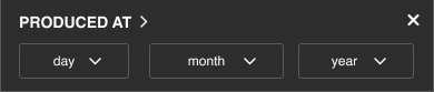
Produced date
A new feature that supplies the production date. Stouts and Barlywines often get better the older they are whilst IPA's you better get as fresh as possible.
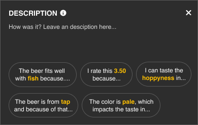
Description with 'smart' prompts
The most important part, where all bracket elements come together in one smart feature. The information you filled in, is used in a prompt, which users can click on to make writing a description more accessible and easy for users. The new description interface design is moved to the bottom of the interface. In this way the interface stimulates writing a review based on the information provided already by the user.
Reflection
This project highlighted the complexities involved in designing smart interfaces, particularly balancing enhanced functionality with user friendliness. Working closely in a multidisciplinary team was highly beneficial, as it allowed us to combine theoretical UX knowledge with practical design and development skills. However, I learned the importance of clear communication and aligning individual design tasks with collective project goals, as initial differences in our visual styles underscored this challenge.
Our final solution successfully addressed the initial problem by significantly improving the reviewing process on Untappd, encouraging more informed and detailed reviews. However, I recognize that we could have narrowed our scope further, as the final interface potentially offered too many features at once, risking cognitive overload. Moving forward, additional testing focused specifically on the autoprompt feature would be beneficial to further refine its effectiveness.