An onboarding for a precision farming platform
Context
For my graduation project in Communication and Multimedia Design, I joined Vantage Agrometius; a leading distributor in precision agriculture technologies as their first-ever UX/UI designer. The company had recently launched Taakkaart.nl, a web platform aiming to become the largest precision agriculture hub in Germany and the Benelux, providing farmers access to a suite of external smart farming apps. However, despite high ambitions, the platform struggled to attract new users and convert visitors into registered members. The main challenge: the value of Taakkaart.nl was not clear to potential users, and the digital onboarding experience lagged far behind the high-touch personal approach offered by Agrometius's in-person salesforce.
Research & Insights
My work began by clarifying what both the company and its customers actually needed from Taakkaart.nl. The initial brief left many critical questions unanswered—What user problems should the platform solve? Who were its core users? What were Taakkaart.nl's unique selling points compared to its competitors?
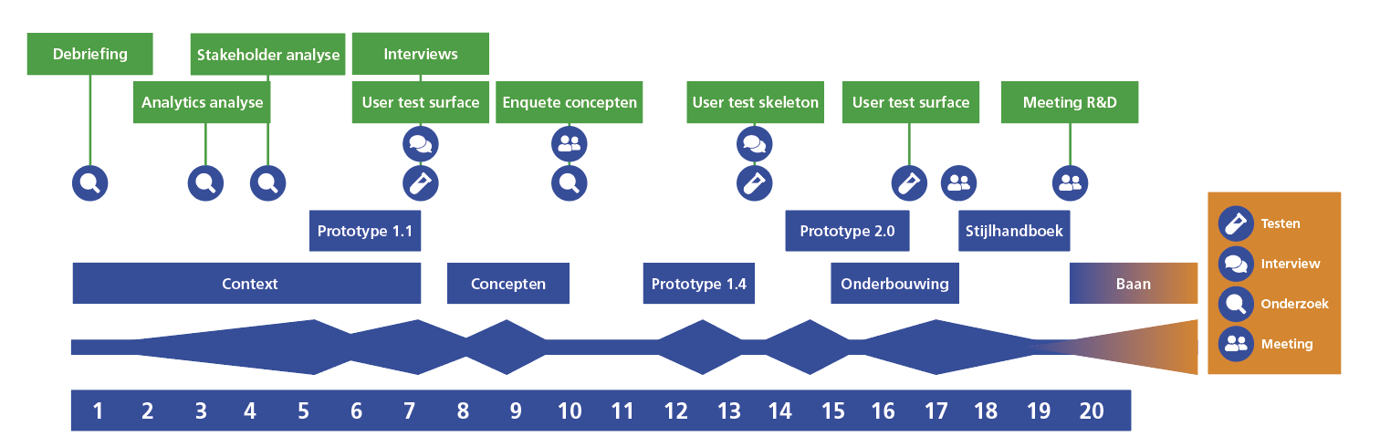
To answer these, I conducted a broad series of studies: competitor analysis, interviews, surveys, stakeholder workshops, and web analytics. The competitive analysis positioned Taakkaart.nl among established names like Dacom, OneSoil, and 365Farmnet. Each had its own approach: from full-featured, internally developed systems to easy-to-use, free, but more limited platforms. Taakkaart.nl's biggest potential strengths were its brand independence (compatible with any major hardware), local service support, and hands-on expertise. However, it was highly dependent on external apps, which limited direct influence over user experience within those apps.
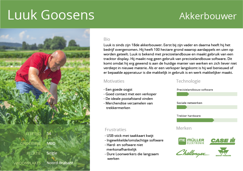
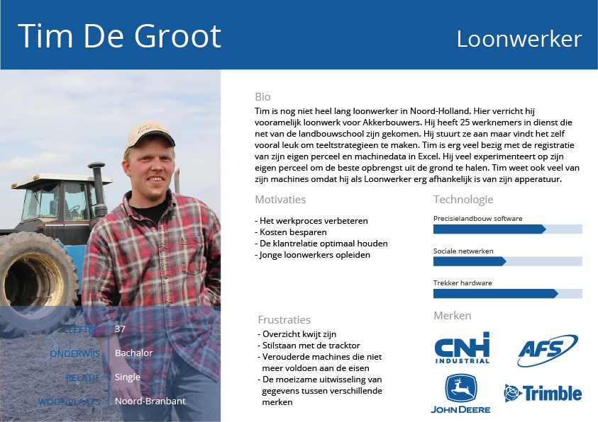
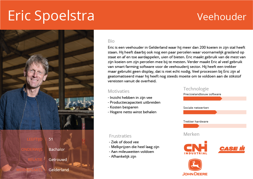
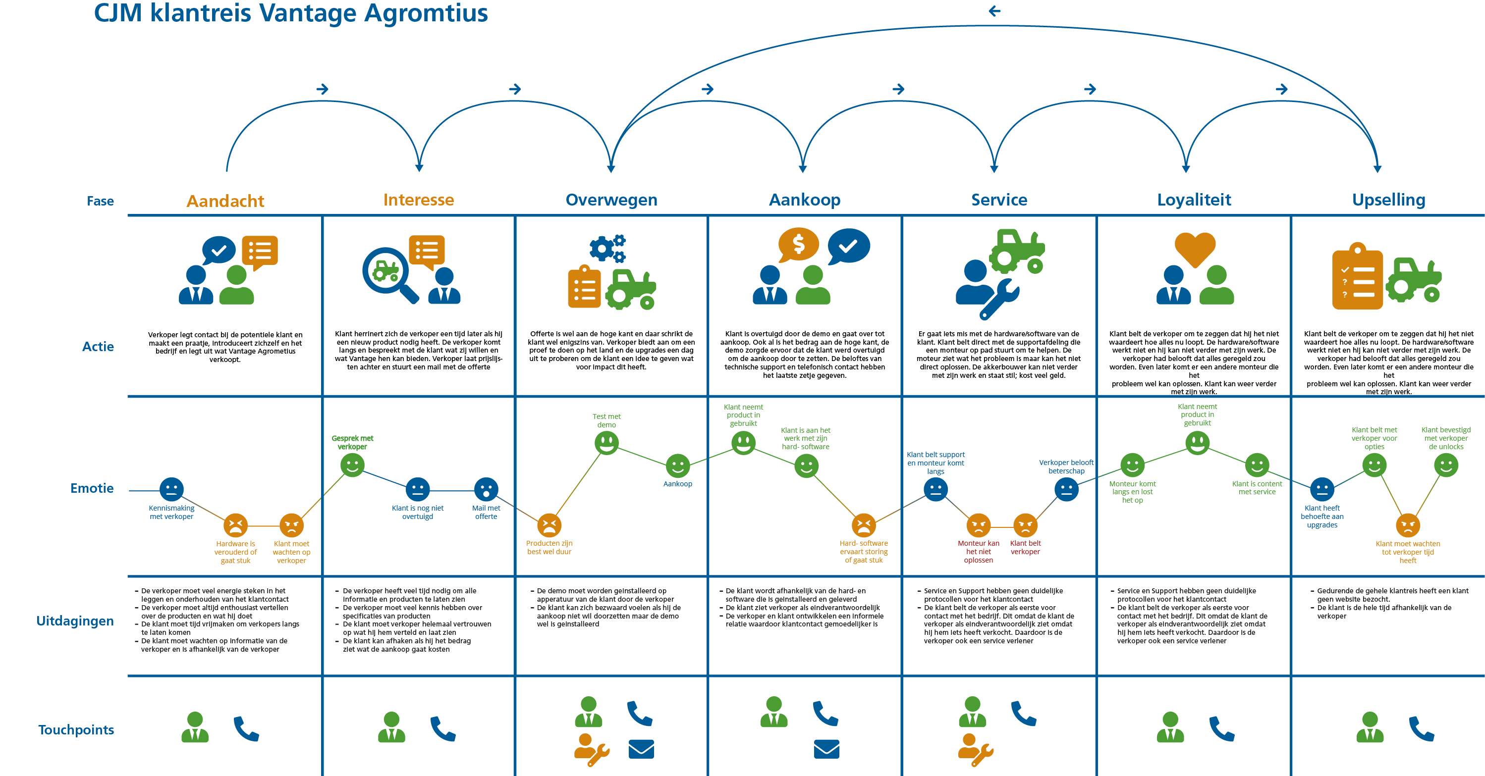
Personas and customer journey maps were constructed from survey responses and interviews. Two main user groups emerged: younger, tech-inclined arable farmers and contractors, eager to optimize with digital tools; and older, more traditional farmers, for whom smart farming technology was still a barrier. Both groups, however, shared a desire for clear information, low entry barriers, and trustworthy support—especially when making significant investments.
Web analytics further revealed the core of the problem: most platform visitors bounced quickly (with an unusually high bounce rate of over 68%), and conversion to registration was barely over 1%. While some might have quickly found what they needed, most users seemed to lack orientation or motivation to dig deeper. The digital experience failed to communicate value or inspire trust, especially compared to the personal touch of Agrometius sales representatives.
Used methods
Design Solution
Grounded in these findings, my solution focused on improving how Taakkaart.nl communicated its value and supported new users. My design process followed a structured design thinking approach, from empathizing and defining user problems, to ideating, prototyping, and testing.
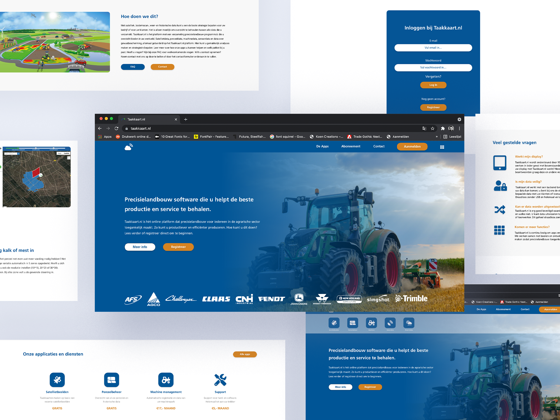
The new platform concept prioritized clear, jargon-free communication. Information was rewritten to directly answer “what's in it for me?” for the farmer, using recognizable agricultural terminology but always with accessibility in mind. I designed new content structures, video explainers featuring trusted experts, and testimonials to inspire trust and guide users. A step-by-step onboarding flow lowered the barrier for trying the platform's “freemium” features, allowing users to experience value before committing. Support and contact channels were made more visible, and the navigation was redesigned around simple, proven UI patterns, validated through both analytics and best practices in usability.
Prototypes were built and iteratively tested with actual users (where possible, despite COVID-19 limitations), and refined based on feedback. Improvements included reducing text, increasing visual communication, and segmenting information according to the needs of different personas. Usability tests confirmed that these changes helped users navigate the platform more confidently, with less confusion.
Deliverables
Reflection
This project was a deep dive into the realities of digital transformation within a traditionally personal, relationship-driven sector. I learned to balance organizational ambitions, user needs, and technical constraints, all while introducing the value of UX research and iterative design to a company new to these practices.
Through thorough research and structured design, I was able to reposition Taakkaart.nl from a confusing tech portal to a farmer-centric digital hub that builds trust, reduces barriers, and actively supports onboarding. While I worked largely independently, I learned to bridge gaps between departments, facilitate alignment, and make design decisions based on real evidence rather than assumptions. Seeing users navigate the new platform with greater ease and hearing from Agrometius staff that the value proposition finally “clicked” for customers was the most rewarding outcome.
This experience cemented my passion for user-centered design and proved how important it is to connect user insights with clear design solutions. Unfortunately they never implemented my design.